LED destination signs: a simple way to make a transport network easier to understand
Passenger information is not only delivered through timetables, maps or mobile apps. It also starts on the street, at the very moment when a passenger sees a vehicle approaching and has only a few seconds to understand whether it is the right bus or coach.
In that situation, the destination sign remains a key information channel.
Visible from a distance and positioned at the direct point of contact between the vehicle and the passenger, it has an immediate role: identify the route, confirm the destination, reassure the user and make boarding easier. When used properly, it contributes to network legibility, perceived service quality and even operational fluidity.
Too often, this display is still treated as a simple technical device, even though it can become a real tool for clarity, consistency and network value.
The destination sign: the passenger’s first reference point on the ground
When a vehicle arrives at a stop, the passenger does not always have time to look for detailed information. They need to identify three things quickly:
the route number or line;
the destination;
where relevant, the main places served along the way.
This may seem basic, but it shapes a large part of the passenger experience. A clear display reduces hesitation, limits questions to the driver and avoids situations where passengers stop the wrong vehicle or let the right one pass because they are not fully sure.
On regular, school, suburban, regional or interurban services, this clarity is even more important because not every passenger is a daily user. A visitor, a student, an older person, an occasional traveller or someone connecting with a railway station may not know the network in detail.
The destination sign must therefore be designed as an instant reading tool.
Good programming is not just about displaying a destination
The quality of a destination sign does not only depend on the equipment installed on the vehicle. It depends above all on how the information is structured, prioritised and programmed.
Two vehicles fitted with similar signs can create very different passenger experiences depending on the logic behind the display:
wording that is too long or difficult to read;
excessive alternation between messages;
destinations that are unclear for occasional users;
inconsistent wording between front, side and rear displays;
information that does not match timetables, stop poles or digital channels;
special cases that have not been anticipated.
By contrast, a well-designed display structure helps align on-board information with the wider network identity. It creates an impression of control, reliability and professionalism.
This may look like a detail. For the passenger, these details build trust.
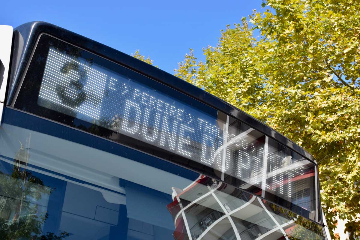
Example programmed by Mobility Consulting on a conventional LED destination sign, with a structured hierarchy designed to improve the readability of passenger information.
High-resolution destination signs are changing the landscape
LED matrix destination signs remain widely used across public transport networks. They offer a strong balance between robustness, readability and reliability, while already allowing more advanced display strategies than a basic destination-only message when their possibilities are fully used.
The gradual arrival of high-resolution destination signs changes this perception. With a much higher LED density, improved typography, a wider use of colours, pictograms, images and animations, these systems are moving closer to genuine external multimedia displays.
This opens up very interesting opportunities for transport networks.
High-resolution displays can make information clearer, more structured and more consistent with the network’s visual identity: stronger route numbers, sharper destinations, line colours, rail station pictograms, event messages, service notices or temporary information that is better integrated into the display.
But this new richness also raises the level of responsibility.
The more a screen can display, the more important it becomes to define a clear editorial and visual strategy.
A high-resolution destination sign should not become a place where messages, visuals and animations are stacked without logic. It must remain focused on passenger understanding.
The question is no longer only: “what can the sign technically display?”
The real question becomes: “what information should be displayed, at what moment, with what hierarchy and for what purpose?”
This is precisely where these new displays become powerful. They make it possible to go beyond the basic destination, without losing the primary purpose of the sign. In service, they can strengthen passenger information. Out of service, at terminals, depots, events or during specific operations, they can become effective external communication media: service promotion, event campaigns, network information, institutional visibility or welcome messages.
High resolution does not replace the rules of readability. It makes them even more important.
This evolution does not mean that conventional LED signs are limited to basic displays. More advanced programming remains possible, for example to improve destination hierarchy, include key points served, use pictograms or work with customised fonts where the hardware and software allow it. It simply requires a finer command of programming tools, graphic formats and the constraints of each display.
The challenge: adding information without reducing clarity
Modern LED destination signs can go beyond the simple “route + destination” combination. Depending on the size and type of display, they can include useful additional information such as:
main stops or key places served;
a rail or metro interchange;
a short working or partial terminus;
a diversion or modified route;
a special event service;
temporary operational information.
The difficulty is to enrich the message without making it confusing.
A destination sign is not an advertising screen or a general notice board. Reading time is short. Space is limited. Its main role is to help the passenger make the right decision at the right moment.
The right approach is not to add as much information as possible. It is to choose the most useful information, in the right order, with the right display rhythm.
Additional messages: useful, but they need a framework
Transport networks naturally need to communicate: ticket validation, safety, events, seasonal greetings, digital services, new fares, works, institutional campaigns and more. These messages have their place in an information and communication strategy.
The issue is not whether they should exist. The real issue is when, where and how they should be displayed.
On a destination sign, an additional message can be relevant when it does not interfere with service identification. For example, when the vehicle is out of service, parked, waiting at a terminus or used as part of a specific operation, the sign can become a visible and effective communication channel.
However, when the vehicle is in service, the display must remain focused on priority passenger information. If the route or destination disappears for several seconds to make room for a secondary message, the passenger loses their main reference point.
The risk is not only visual. It can become operational: hesitation at the stop, repeated questions to the driver, slower boarding, uncertainty about the actual route of the vehicle.
Effective communication should not compete with essential information. It should complement it intelligently.
A well-designed destination sign also improves the network’s image
The destination sign is one of the first visible elements of a transport network. It contributes to brand perception, even when this is not always consciously noticed.
A clear, stable, consistent and well-prioritised display gives the impression of an organised network. It shows that the operator and the transport authority care about the real-world passenger experience.
By contrast, a poorly used display can create an impression of improvisation, even when the service itself is well designed.
This is particularly true for regional, interurban and school services open to the public, where legibility can be more complex than on a dense urban network. Destinations may be long, routes may have multiple variants, and connections may play an important role.
In these contexts, the destination sign becomes a tool for clarification.
Thinking of the sign as part of the wider passenger information system
Good destination sign programming should not be isolated from the rest of the information system. It should be part of a wider logic covering:
stop names;
timetables;
route maps;
on-board audio and visual announcements;
real-time information systems;
stop infrastructure;
the website;
field communication.
When these elements use the same wording, the same destination logic and the same geographic references, the network becomes much easier to understand.
This is where the destination sign takes on its full value: it translates, on the vehicle, the promise of clarity built across the rest of the passenger information system.
It should not be handled at the end of a project as a simple technical constraint. It deserves to be included from the start of the passenger information strategy.
Simple principles for more effective destination signs
A few principles can already make a major difference.
1. Prioritise the route and destination
Passengers must be able to identify the service immediately. The route and destination should remain the dominant pieces of information, especially on the front display.
2. Adapt the message to the display size
A large front display may allow more information. A smaller rear or side display requires more direct wording. Not every display has to show exactly the same message.
3. Avoid unnecessary alternation
Alternation can be useful when it adds real value. But if it slows down reading or makes the main information disappear, it becomes counterproductive.
4. Harmonise wording
A destination should be worded consistently across vehicles, timetables, stops and digital channels. Consistency reassures passengers.
5. Anticipate special cases
Short workings, diversions, event services, school services and route variants should be planned in advance. A well-structured display database avoids last-minute improvisation.
6. Promote the network without overloading the display
Destination signs can support the image of the network, but they should do so with restraint.
The best communication is often the one that makes the service easier to understand.
A small display with a very real impact
Whether conventional LED or high-resolution, the destination sign is not just an on-board device. It does not replace a good service offer, a complete passenger information system or a structured communication strategy.
But it has one decisive advantage: it acts at the exact moment when the passenger needs it.
That is what makes it strategic.
When properly programmed, it improves service understanding, reduces hesitation, enhances the network’s image and supports drivers in their daily work. With new high-resolution systems, it can also become a more expressive, graphic and dynamic external communication medium, provided it remains guided by a clear passenger information logic.
At Mobility Consulting, we support operators, transport authorities and mobility stakeholders in structuring their passenger information, from destination logic to operational destination sign programming.
The objective is simple: make the network easier to read, more consistent and easier to use on the ground.
Want to improve the clarity of your destination signs?
Mobility Consulting can support you with display audits, destination hierarchy, sign database preparation and alignment with your wider passenger information channels.
Contact Mobility Consulting to discuss your needs.